156L
Skin/Accent Shading Tutorial
20 June 2024
SITE
⠀⠀⠀about
⠀⠀⠀home
⠀⠀⠀gallery
⠀⠀⠀tutorial
COMMISSION RELATED
⠀⠀⠀prices
⠀⠀⠀tncs
⠀⠀⠀links/contact ↗
art + code + website : 156L ⊹ 2020 - 2024
FLIGHT RISING - Shadow basics aka : why you shouldn't go too ham with the details
Having being on this website for an ungodly amount of time, unless you were obviously making a skin as an art piece instead of purely decoration, many users have shifted to three main styles :
- flat colour artwork, little to no instrisic shading, usually clothes | [image, redsparrow]
- the dragon is now a canvas | [image,katalist]
- a combination of both, sometimes | [image, 888]
![[image, redsparrow]](/artwebsite/tutorialpages/tutorialimages/frshadow/46585.png)
![[image,katalist]](/artwebsite/tutorialpages/tutorialimages/frshadow/53636.png)
![[image, 888]](/artwebsite/tutorialpages/tutorialimages/frshadow/56192.png)
i assume you most likely have read the crash course tutorial, but in this case, i'll still just list what i have/use for this one.
- i exclusively use Paint Tool SAI for the whole process. you can use whatever as long as it can handle PSD functions and doesn't crush it into one thing.)
- 750px - 1500px canvas, resized with the DPI function usually
here's the guide in the most TL;DR Terms possible :
- - make a really vague sketch
- - start drawing from there
- - flat colours
- - very basic shading
- - clip and line
-----------------------------///
1 : Make a really vague sketch.
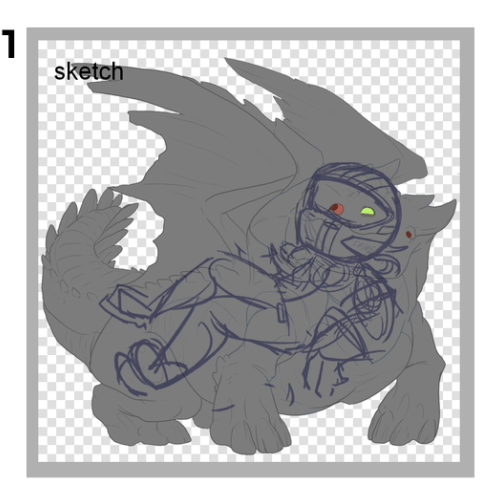
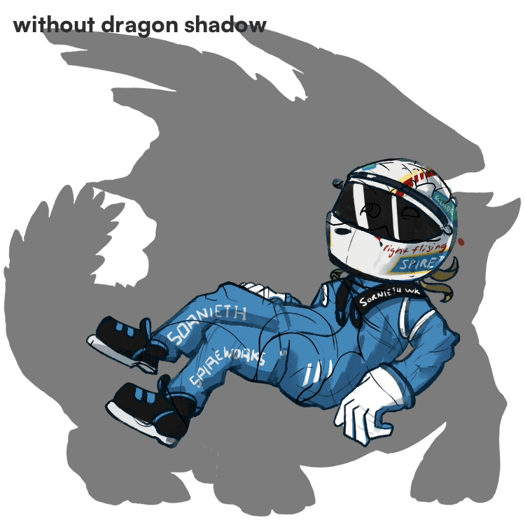
this one is really self explanatory. hide all layers except "Accent Goes Here", the shadow set to 50%, and grey base of the dragon. sketch your heart out. refine this sketch as much as you want. for this i was trying to make a racinf driver themed skin for my FR Avatar so here's naturally where it led me, a pose that had the helmet at the face and the body everywhere else.
2 : Draw the lineart.
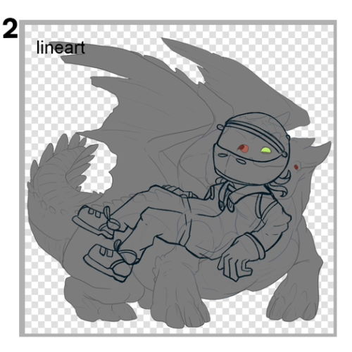
draw the lineart, the cleanest you can get. the outer border of things. no little symbols or anything, just lines.
3 : Add in the flat colours.
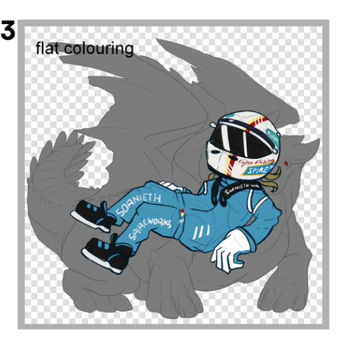
Now this is where the majority of the detailing goes. NOT THE SHADING, THE DETAILING. here you can i see i have crammed in everything like the sponsors all over the helmet and the jazz, but there is absolutely no shading whatsoever. This is the part where you put in your everything, with the power of flat colours. draw your leaf veins with darker green. things like that. If you add shadows in this step, you will have 2 things to think about and that makes the image a confused mess.
4 : Use FR's provided shadow layer and clip it to the image.
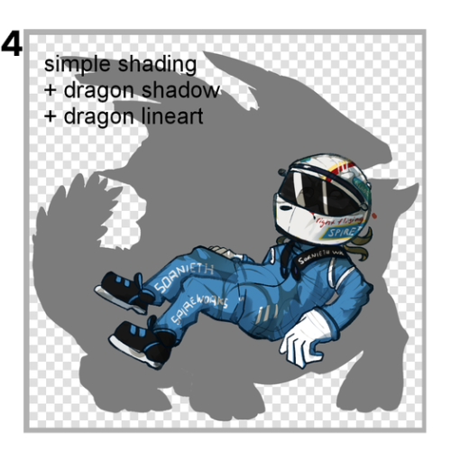
Bam. The snapper's shadow layer is clipped on top of it, and now you can see what it has helped me with : creating the clothes "folds". At this point, you can tint the shadow with a colour to avoid a goopy grey mess, and add a bit of shading on top of the flats to emphasise a slightly more darker area. On this step, you can also colour in your lineart layer from #2. Apparently, making lineart an additional colour is called "colour hold", so that's something new for your normal art projects. It makes your lineart naturally part of the picture instead of sticking out like a sore thumb.
5 : remove the base and clip the official lineart to it.
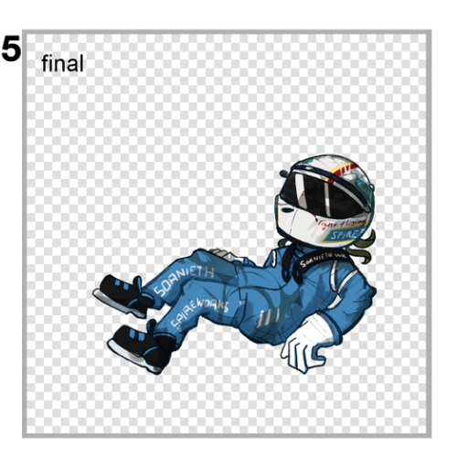
Now you can see the final image! Colour hold for the official lineart as well to blend it in, taking care no to make it too light or the same colour as the drawing below it. You can see the before after in the gif below it :