painting with black and white vs painting in colour : what's good?
26 June 2024
>These are the observations that I have made from painting in BnW for 6 months, and colour for another 6, so over the course of a year. Here's the pros and cons of each style, what I think about them, and why there are very different use cases for either start.
▶▶▶Directory▶▶▶
- intro
- black and white : pros and cons
- colour : pros and cons
i think a lot of people when they looked up drawing references have seen like, two types of tutorials : those by madlad artists who manage to pull out a whole drawing from scratch from some grey, and then the other madlad half who throw a bunch of colour on the canvas after drawing a few lines and make a masterpiece from there. even to this day these artists boggle me. and sometimes while painting you go "what colours am i supposed to be using here???" because the colour painting is muddy. or the black and white was really hard to perceieve.
Anyway after testing both, it's kind of a utility thing. TL;DR : black and white is great for high focus on detailing and a generally more somber/realistic look, while colour is great for a focus on the colours for intended energy of the piece + a much more fantasy feel.
black and white + pros and cons
One of the main things to start with or completely stick with a black and white pieces. They let you focus on the little details with absolutely zero need to think about colours -- you can worry about it once you have finished humming and hawwing about whether this line would make or break the image. it was boggling at the start because i now completely had no access to colours...until i realised forcing me to use the greyscale removes the problem of "thinking about colours, lighting, and detailing" all at the same time!
black and white are great because there is a solid middle grey starting ground. if you go lower on the luminance, you get darker grey. if you go higher, you get lighter grey. when you apply this layer by layer, you get a form. when you (gently) blend the colours together, you get, well, organic forms!


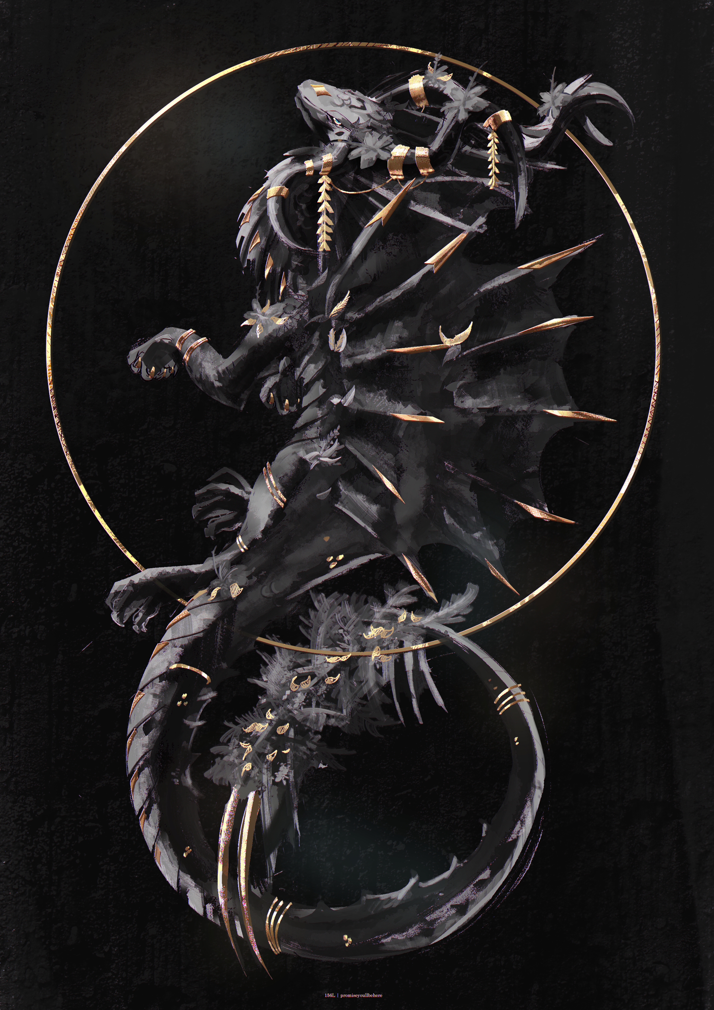
you can see with the examples above that the images w